If you want to create a beautifully cut diamond, you cannot begin with a lump of coal. No amount of chipping,
Alan Cooperchiseling , and sanding will turn that coal into a diamond.
Throughout my career, I’ve met various designers. A part of them did solely drawings, while others were focused on the books. As time went by, more of them turned to mobile apps and dived into the digital domain. However, not all are willing to sacrifice a little to learn the usability rules, and delaying that process takes an inevitable toll on your work.
Visual design, as the name says, is the first thing a user sees. The rule of thumb is the more refined, the more credibility it will have. Who would even want to stay on a site that’s user-unfriendly and lacks aesthetics in this day and age? Well, about 0% of your typical internet user population.
So, let’s elaborate a bit further.
What Is Visual Design and Why Is It Important?
The first time a client needs to up their visual design game, they will usually say “I need my website to look beautiful.” I don’t blame them. They’re both right and wrong. Why they’re wrong? It’s easy to cram visual design into such a sentence, when in fact, it’s so much more. But we’ll get back to that in the third heading.
Why they’re right? After all, your website, as generic as it sounds, has to look beautiful. It’s the first impression that always counts.
Sadly, beauty lies in the eyes of the beholder and you’re creating for individuals so you have to accept your work as such. Luckily, more than one method can help you to understand the user’s needs, whatever they turn out to be.
In other words, visual designer or User Interface Designer will take care of the web design. They will improve the wireframes (done by User Experience designer) by balancing, rearranging, illustrating, and by using different lines, shapes and
Secondly, visual design helps the brand to become recognizable. The visual aspect of a company is the first thing a client stumbles upon. If the perception is botched from the beginning, there’s little to do to improve the flawed brand image.
That brand image has to speak to the client to create, among others, trust, customer loyalty, competitive edge, customer retention, and lastly, higher sales. Moreover, you’re likely to win over the hearts of the audience that was once on the competitor’s side.
Trust is a huge factor and it can serve in your favor but also ruin your efforts.
Imagine you speak to the person you hired to redesign your living room, only to find out they have no previous experience whatsoever. Plus, their auto-eulogies over the phone seemed so convinceable… From the client’s point of view, they broke their trust. When we invest more time and money into our personal improvement, we’re likely to be perceived as better in the field.
The Basics of Visual Design
Numerous websites look pretty, but the functionality somehow gets left behind. On the other end of the spectrum, some of the most functional websites look as if they’ve been made by a 3-year-old. However, it can be beautiful and it can be functional.
Let’s get back to the 3-year-old. If he failed to learn how to crawl, he wouldn’t have learned how to walk. Although it sounds banal, designing is much the same. There are a few basic elements that go together when making a visual design:

Lines, which connect a starting and an end point, are used to create shapes, simulate texture, and define boundaries. They can also serve as a contouring instrument, indicate motion and give a depth illusion. Be it a straight, broken, thin, thick, or a bent line, it is the most crucial element in the design.

Shapes are specifically defined two-dimensional areas surrounded by lines. Each object a designer uses has a certain shape. They can have different attributes, which make them stable (rectangle, square) or dynamic (pyramid, trapezoid).

The form describes 3D objects – the mass and the volume. The base of the form is a shape, i.e., forms are enclosed by surfaces. Textures and colors can make them stand out.


The texture is what you can feel under your fingertips. It’s called physical texture. Naturally, by no means will people touch their screens (hello there all you smartphone users!) only to better visualize what’s in front of them. Except for people with visual impairment.
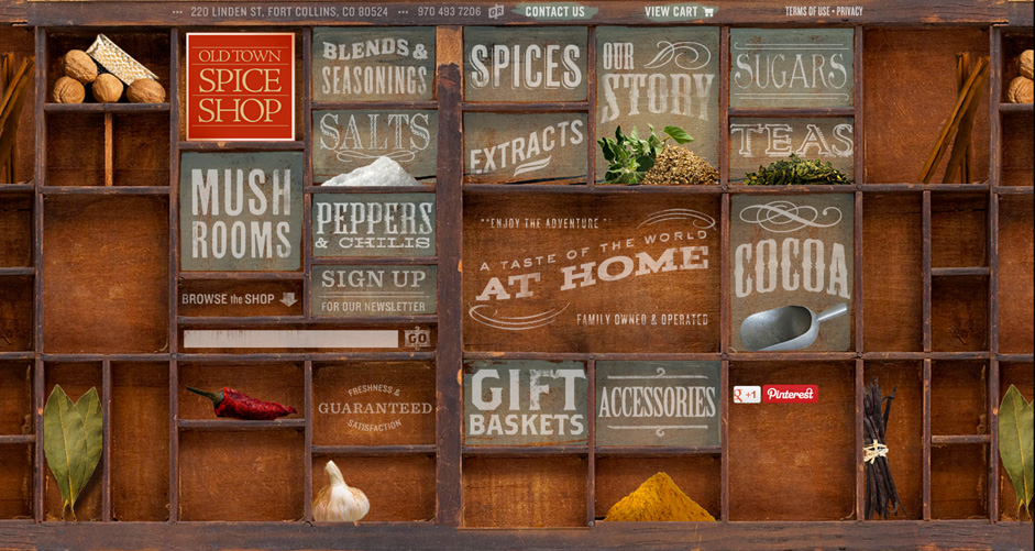
In visual design, we call it visual texture. It is used to attract attention and it can be seen, for example, on the Old Town Spice Shop’s website.
Typography is, simply put, the science of fonts. Designers choose their color, their size, the type and then place them onto the surface.

The 9 Principles in Visual Design Creation
Since visual design pieces won’t hang on a wall of a gallery, a designer must follow a certain set of rules to be able to combine beauty and functionality.
When we’re talking about unity, it’s essentially a harmonization of all elements on the page. Those elements have to be aligned so that the viewer gets the feeling they belong together. Here we must add diversity, otherwise, the design would end up uninteresting.
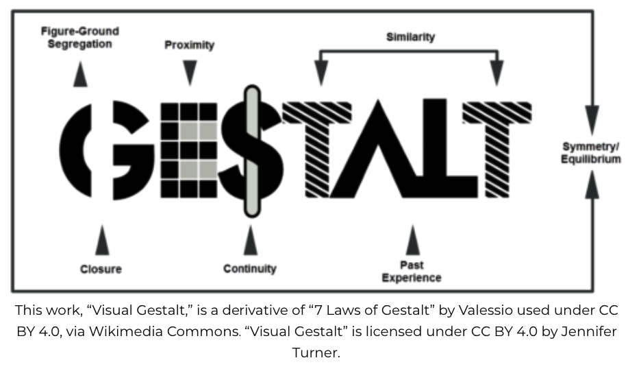
The second principle is called Gestalt, refers to the perception of the whole before the perception of each element. It consists of similarity, continuation, closure, proximity (grouping), figure/ground, symmetry, and past experience. When every element is organized accordingly, the Gestalt of the piece is well made.
Between the elements, there has to be white space, which is best described in the Importance of White Space in Design:
White Space in design composition is the same as the use of Silence in a musical composition. Without the proportionate use of Silence, music is unstructured; some may call it noise. Similarly, without White Space, the design is unstructured and difficult to consume.
The white space helps with readability, emphasizes certain objects, decreases the noise, and can create an illusion. When discussing white space, there are 2 main types:
- active white space – a designer left it out with an intention, it separates the elements on the surface
- passive white space – so-called “default”, this space is usually near the borders or in the middle of the content to improve readability
The third, visual hierarchy, expresses the order on the page. It is the sequence by which the viewer process the elements they see. If the piece lacks a defined visual hierarchy, the viewer will follow a culturally influenced reading path, which is predictable because of the standard reading direction of written text.
Hierarchy is made with the help of
It makes them at peace with everything that’s going on. We can apply the same to the balance in visual design. There, it indicates that we have a proportionate distribution of the elements.
As in life, the balance isn’t always based on symmetry.
The fifth principle in visual design, contrast, makes the objects differ one from another. By accentuating the change in color or size, the designer contrasts the items of the piece.

Scale refers to the size of the object in relation to the surface. A designer can make a sense of depth, as well as articulate order.

The seventh principle in visual design, dominance, creates a feeling of superiority. Either the elements will correspond to each other, or the one will stand out so that the viewer can perceive it faster.

The last one, similarity, makes the viewer notice the continuity and the relation between items on the piece without duplicating them.
Design and Development: A Pair Rather than Enemies
Just like peanut butter and jelly go together, the design and development have to collaborate together. If you’re a company owner, ensure your designer and your developer work together. You can show them the following six-ingredient-checklist for a successful cross-functional collaboration.
Stronger communication – again with the banality; however, a strong and pragmatic communication sets tiles to the logical solution path.
The focus on the user – Remembering you’re not in the project only for yourself but for the benefit of others helps to focus on the user’s goal.
People think focus means saying yes to the thing you’ve got to focus on. But that’s not what it means at all. It means saying no to the hundred other good ideas that there are. You have to pick carefully. I’m actually as proud of the things we haven’t done as the things I have done. Innovation is saying no to 1,000 things.
Steve Jobs
Early involvement – An early cooperation in the project means better relationships with the designer and the developer. In fact, a study by the Department of Industrial Engineering and Management at the University of Oulu in Finland found out that the earlier the involvement, the higher likelihood of
Getting on the same page – When it comes to the fonts, buttons, sizes of margins, the designer and the developer need to come to an agreement. Otherwise, they’ll lose time and suffer unnecessary headaches.
Asking questions – What parts of the design should we improve? How a certain element adds up to the picture? How shall we test out the functionality? All of these should be considered while working together. Naturally, there are many more questions and you shouldn’t fear to ask them.
Check-ups – In every healthy relationship, you ask how the other is feeling. In the designer-developer relationship, check-ups are as important. Both have to ensure that the project is going smoothly and that the product idea aligns with the execution.
PS. I wrote about “How to handle and manage
The Client and the Designer or On Importance of Communication
A visual designer has to connect with the client to talk about their expectations. The client, on the other hand, has to respond in a clear and timely manner. Without communication, everything may fall apart.
However,
Only you know your business to the core. Although a designer may get access to a ton of information about the target audience, they may still fail to understand their intention when they land on the site. That’s where communication steps in – you have to work out the tiniest detail with them so they can know what the audience wants and start designing.
The dependence is mutual. First, you, as the client, have to lay out the basic information. After that, the designer must ask anything they’re confused about. Next, the client gives their input again, following by the designer’s input. It’s like playing on the teeter totter. Once one of you stops communicating, the game’s over.
The majority of the clients don’t have a clue about the designer’s line of work. It’s why they hired someone to do the job! Ok, maybe some of them will know the technical language, but most of them won’t. Being able to produce what the designer had in mind in a simple manner takes skills, therefore, give them a little time to adjust to your language. It’s nothing that they can’t master.
Effective communication is half the work. Everything starts with a conversation. Sometimes the only thing that can make you the right candidate for the job is your way of communicating the idea to the client.
Clients will worry if there’s a lack of information from the designer’s part. However, as a client, don’t mind asking questions, even if you aren’t entirely sure what the designer had in mind. The purpose of the questions is to find out what the end product is going to look like, after all.
Design Tells the Story About Your Brand
In case the work innovation is something you never heard of, here’s the definition from the dictionary:
innovation: a new method, idea, product, etc.
To be innovative means to constantly evaluate what you do. Launching a new product means little if there’s a poor design behind it. Plus, no improvement process afterwards will make the product seem dull.
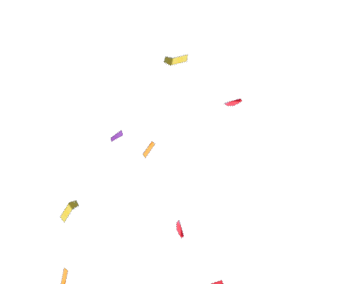
When making a B2B product, the biggest mistake companies make is adding too many elements. I mean, how is your viewer going to notice what he has to notice if you throw confetti at them?
It’s the distraction by trends that you have to get rid of. For example, imagine a competitor adds a bunch of everything to their site. You would want to have such a site and then ask the designer to make a similar one. The crucial thing to comprehend here is not the similarity but rather the fact that even if it’s about the same business, you should tell your own story and not the story of John Doe’s tractor business.
The story has the power to instigate deeper feelings in humans. The regular viewer expects to be amused and touched emotionally, so telling them about your brand creates a stronger bond between your customers and your product.
Still, telling a story without a background is like planting a flower in the middle of the desert: it doesn’t have the grounds to come into
A simple and clean design will never go out of style.
One way to have a clean design is by staying consistent. The headlines, the buttons and the use of
Being Bold Counts, Too!
A recognizable brand is timeless (classic), has its story and makes bold moves. It will challenge the viewer and create curiosity. According to Paul Woods, there are 5 stages of brand acceptance:
Denial
Huh, I don’t get it. This is absolutely awful.
Continued denial
I still don’t get it.
Curiosity
No, hold on a second, I’m seeing something here (squints at the screen)
Epiphany
OMG, now I get it. This is f genius.
Depression
Why didn’t I think of that?
What he wanted to say is that the brand design has to stand out from the competitors and has to be awkward sometimes. There’s no exact recipe for being bold when designing. After all, it depends on the users, the brand image and the creativity of the visual designer.
Going over the top and breaking the established standards may attract the unwanted criticism, but hey, even Nicolaus Copernicus was considered a madman when he stated that the Sun is the center of our Solar system.
The Design is for the People. Not Robots.
Product value is a characteristic that often gets swept under the rug. I’ve seen countless sites where the products simply lack value and the site’s design reflects that.
To add value means that a real-life person should require your product to solve a certain problem. In visual design, there are a few questions to ask before starting to work on value.
- How to improve the specific feature we have problems with?
- Why the click-through-rate is so low (CTR)?
- What can we do about CTR?
- How can we increase consistency?
- Can we simplify the design? If so, what is the buyer’s journey or where do they look first when landing on the page?
- How can we minimalize the design?
Developing value in the design starts with the user. Delivering as much information to the designer makes them prone to create with the user’s issues in mind.
You may wonder why the simplicity and the minimalism matter. As said, complicated design confuses the viewer and will scare them away before they even clicked on the Products’ page.
Also, minimalizing the design is another definition for making something directed at the essential so the customers can understand in a matter of minutes how to use it.
Following a Business Strategy
Someone once said the greatest designers are, in fact, business strategists. When the question of the design was still only an afterthought for developers, numerous poorly-designed websites emerged.
Luckily, companies started investing into a better design process since visuals have an immediate effect on a user’s journey. With it comes a multitude of other sub-fields, such as information architecture, market research, art direction, user experience, responsive design, engagement strategy etc.
A designer can’t be an expert in all of the mentioned fields, but they do overlap and need to be analyzed and taken care of holistically. I believe you should add the business strategy in the mix, unless your design boat is going to sink soon. Why?
Because you should anchor your brand goals and the needs of the customers to the design.
The most critical part of solving business problems through design requires investing in learning about a client’s business and its competitive space. We often forget to approach our client’s problems with the same level of rigor that we would approach the formal design process. Over time, this is how a designer becomes a strategic partner for her client. This process often begins with asking the right questions during the proposal stage or while writing a brief.
Expecting that the designer will do everything is exaggerating, but a good designer will surely understand what it takes to include all of the fields in the designing process.
Even if it comes to marketing, the designers must know the trends and adjust the website accordingly. For example, when a company decides to promote on social media, the design has to be consistent through all platforms.
In other words, the landing page a user is going to end up on has to contain the same colors or images, along with the same call-to-action and the offer they are advertising.
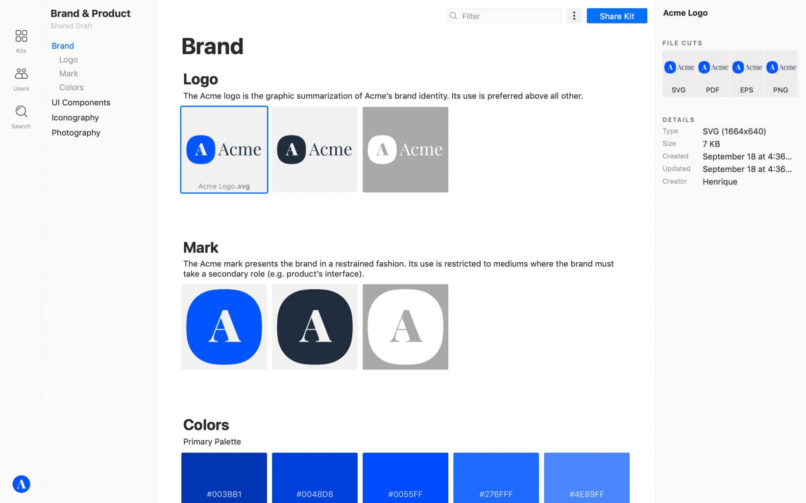
Creating a Design System
To keep the whole team in the loop and create consistent design across all platforms, you should think about creating a Design System. There are several ways to do that. I will write more about the ingredients for a successful Design System in my next blog post.
Ps. In the mean time you can try Lingo (plugin for Sketch) and create your first shared assets library.
Short summary
- 😎White space is your best friend.
- 🤩Simplify. Simplify. Simplify.
- 🥰Make your story alive with proper design.
- 📐Stay consistent.
- 🙏🏼Use design elements consistently.
- 🤪Be bold.
- ☝️Don’t be a copycat.